Increasing CSAT Scores 75%
Identifying and redesigning a key usability issue
Timeline:
May 2022
Project Overview
Hotfix Solutions
My Role:
UX Designer
Company:
HealthPrize
HealthPrize launches their new Payer platform for a client and faces a major usability issue with their medication tracker.
An API system error imports user medication information incorrectly
100’s of frustrated support tickets come in, requesting the support team to update their med list manually
Frustrated with their first impression, users begin abandoning the app
Med tracker features CSAT score was 2.4/5
The Process
I met with the CX team and identified a key compounding issue - users were unable to find where to add/edit the medication
I rapidly performed user tests and confirmed poor navigation UX was the root cause
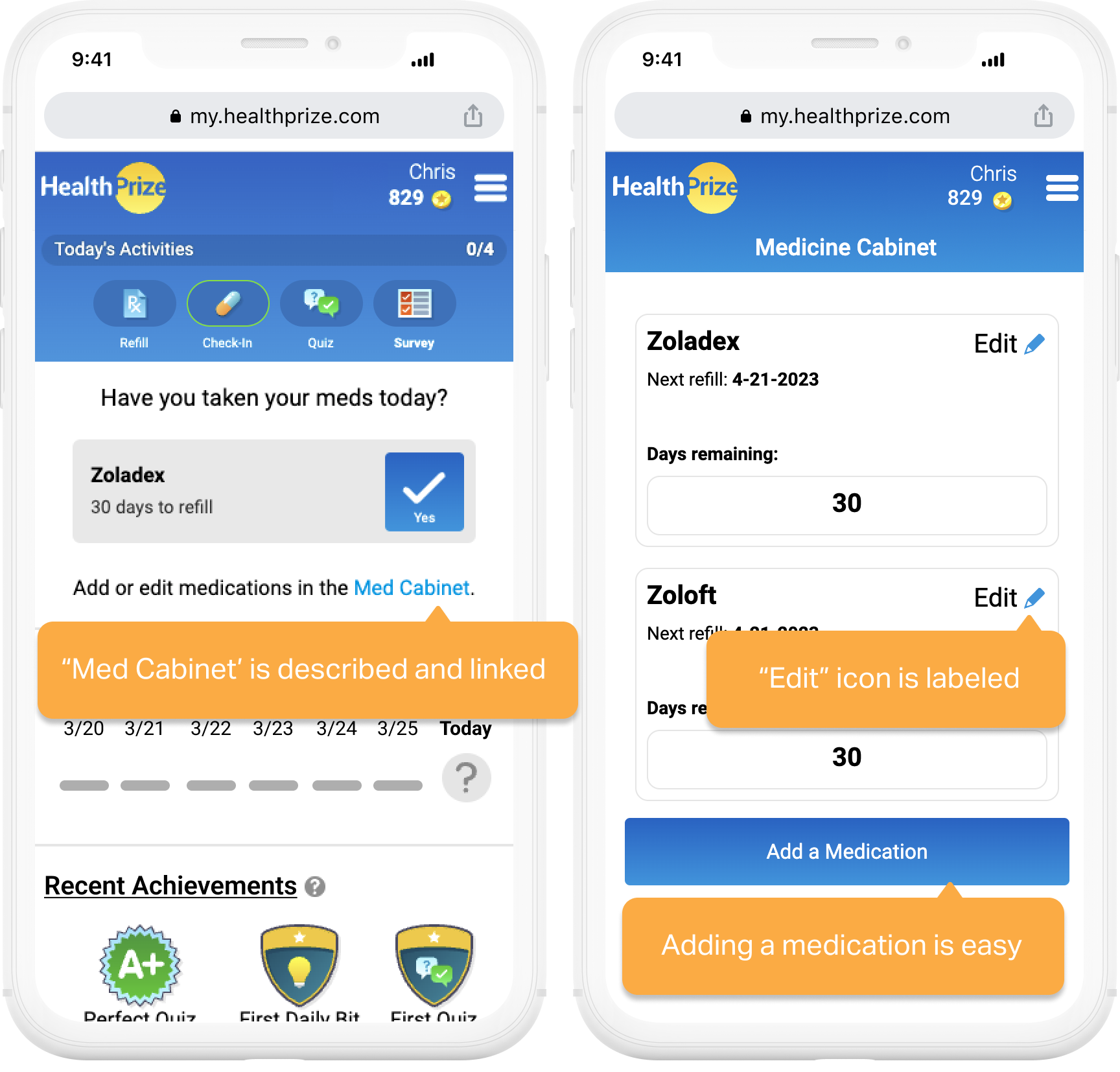
Give the users the ability to add, edit, and delete their medications with clearly labeled affordances
Implement hotfixes now to retain users, make space on the product roadmap for a navigation and full feature redesign
Our 70 year old user base appreciated the lack of ambiguity with the hotfixes - CSAT scores surged to 4.2/5
Interested in reading about my process for a full redesign of the Medication Tracker? Continue below - or contact me directly for details.

Redesign Prototype
Full Redesign Case Study
Kick-Off & Setting Goals
After seeing the early issues of the med tracker, there was low confidence in the feature. Minimal usability testing or research was done, and the high amount of tickets had the team pushing for a full redesign within limited development resources. With thousands of new users were coming to the platform and experiencing difficulties, we needed to act quickly and outline some tangible goals within our constraints.
Project goals:
Identify the problematic screens/flows, provide low cost fixes
Learn how our users manage their medication, and what needs they have that the tracker could fulfill
Redesign the tracker into a feature we can have confidence in

PHASE 2 - DISCOVERY
Phase 2 Kick-Off
With hotfixes in place, customer support tickets for the med cabinet dropped dramatically. Our next step was to dive deeper into what we can offer our users. I started by taking a step back to find qualitative insights and validate them with a quantitative survey for my team.
Medication Interaction Concerns
I elected to perform some user interviews to learn about participants’ day to day management of their medications. I organized four, 30 minute phone interviews with men and woman that take multiple prescriptions and are between the ages of 50-80. I wrote the questions and conducted the interviews.
I was surprised to learn participants were not very interested in medication reminders. This went against our assumption on this feature’s value. Participants already had habits in place, and used pill organizers. On the other hand, there was alot of concern about taking their medications safely. The average co-morbid person of 70 years is on 4+ medications, and are more susceptible to interactions.
Heatmaps & Video Recordings
I took a look at user heat maps and video recordings via our HotJar tool. Acting as an observer can help suss out some usability issues, and give a look into how users interact with the webapp naturally and without instruction. This led to two findings:
When adjusting the supply quantity of a medication, users end up clicking the up arrow a lot.
Users will click the up arrow from 30 all the way to 90 (3 months supply is a common quantity). That is 60 clicks.
Users are frequently clicking previous “check-in” days on the dashboard, that are not “checked-off”
I believe users are attempting to mark previous days as having taken their medication. A few survey respondents of the open ended question mentioned they want a way to mark off previous days. This could be further validated with another quantitative survey - or quickly implemented by development.
Maintaining a Med List is Important
I had some ideas on where we could improve, but my interview participants did not do any digital med tracking. Why were our users utilizing the med cabinet now - and where might we improve on that? I ran a popover survey for users while in-flow of utilizing the med cabinet. This was a short three question survey with a benchmarking score, an open-ended and a quantitative question aimed at finding what users like about the feature.
Overwhelmingly, HealthPrize users like to maintain a detailed list of their medications and supplements (which can often be 6+ medications long).
This validated a hunch in Hypothesis #2: “We lack medication details.”
Research Conclusions
Users are concerned about drug interactions and adhering to common warnings
Users primarily use our platform as an electronic list of their meds, and want to list more details
Our users (average age 70) can have issues navigating the app

PHASE 3 - REDESIGN

WIREFRAMES
New Feature Additions
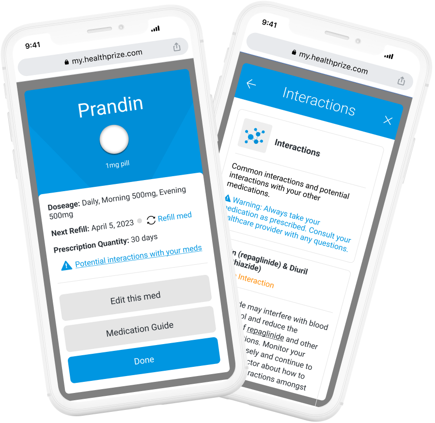
Research has shown that users are concerned with taking their medications safely. Medication guides (like the paper pamphlets handed out at the pharmacy) and a list of common drug interactions are free from commercial cost for HealthPrize to take advantage of.
Drug Interactions
Users can view potential interactions amongst their medications, as well as common interactions. Partnering with a resource like RxList.com could potentially allow HealthPrize users to view interactions amongst the medications in their Med Cabinet.
Medication Guides
Users can view potential interactions amongst their medications, as well as common interactions. These are provided free for [use] from the FDA.
Taking our user by the hand
Usability testing sessions indicated our user can have issues with basic interactions, and often need to add 4+ medication when starting the HealthPrize platform. To deliver a more user friendly experience to a multifaceted process, I created an “Add a Medication” wizard to guide the user.

Layered details and flexibility
HealthPrize users use the system to maintain a list of their medications & want more details. The system was built on frequencies not commonly prescribed. This system now has layered flexibility to accommodate the majority of medications as they are really prescribed, not just in pill form. Users can see their dosage amounts, and list multiple dosages by the time of day.
Old System:
❌ No dosage amounts
❌ Only 1 Dose/day max
❌ Only 1 Form (Pill)
❌ 3 Frequencies, 2 don’t match normal prescriptions
✅ Daily (one dose)
❌ Weekly (one dose)
❌ Once a month (one does)
New System:
✅ Dosage amounts for 5 forms (pills, injections, soluables, etc.) of meds
✅ 3+ Doses a day (Morning, Afternoon, Evening)
✅ 4 Frequencies that are prescribed by doctors
Daily
As needed
Every other day
Select Days (multiple times a week)

Final Thoughts
This project was an immense undertaking and demonstrates what a little user research can do to amplify what a feature can offer. With more time and fewer constraints, I would take a few more actions to ensure this redesign’s success:
Test the new system for usability issues
Survey users on new feature additions... Is it worth it for HealthPrize to partner with a website that can give users interactions amongst medications?
Benchmark the new feature to display improvement from the old system
This was a great project to plan and execute user research, work within tight constraints, and develop HealthPrize’s understanding of their user base.
Thank you for reading! Please feel free to check out my other projects below 🙂


